My Role/ Visual Design Team Lead and Design System Advocate
Visual Designer / Taylor Nanney
Front End Developer / Austin Wilgrub
Tools / Adobe XD / Storybook Site
Opportunity
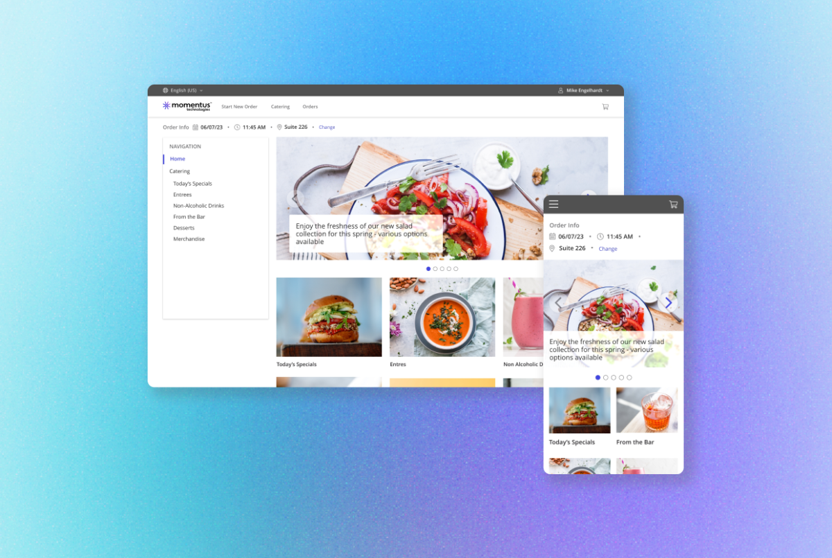
Momentus (formerly Ungerboeck) has a long history in the event management software industry with over 25 different applications and with continued growth projected. It was clear that communication between teams and communicating to the user that we built reliable products were vital going forward.
Objectives and Principles
Consistency – Creating a modern and branded UI
Efficiency – Building a source of truth for product teams to reference
Ease of Use – Improve usability, accessibility and overall user experience
Color Palette
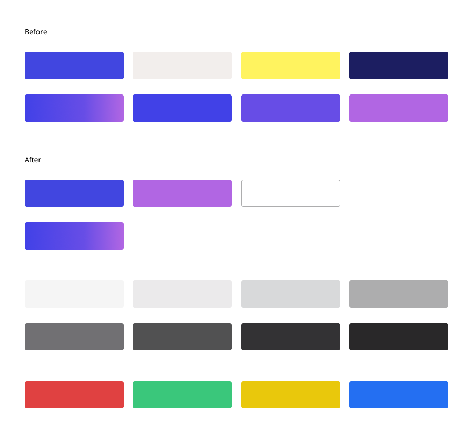
We translated marketing brand colors to a more web friendly palette and one that fits the products’ needs.
Components
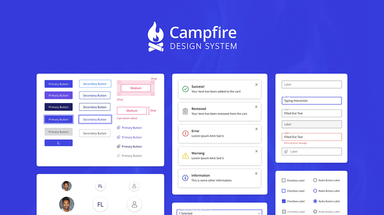
We crafted adaptable, interactive components that could fit the various complex use cases for an array of users.

Layout/Spacing
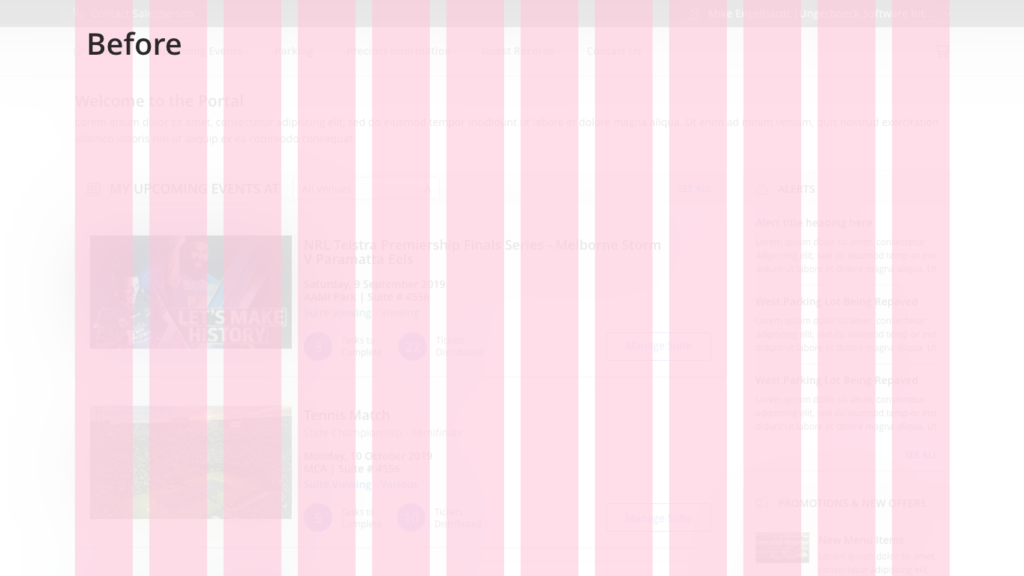
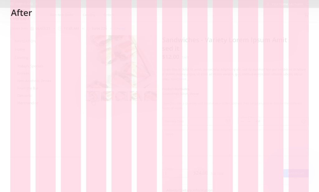
We collaborated with our developers to revisit our grid system and to make it more intentional. We increased our breakpoints and changed to an 8pt grid system.
Reflections
This was a side project that I worked on after I was finished with my product work. I learned that I love design systems and systems thinking. If I could redo one thing, it would have been to get more understanding of the technical limitations of our products in order to better communicate an implementation timeline.
The Process
I was able to start collecting the UI patterns by taking inventory and organizing them as components in Adobe XD using a library. Our products used two different frameworks, therefore we had to accommodate for the older products as well. Next, we collaborated with UX Designers, Developers and Product Managers to examine the existing components and decisions were made on when and what to update. I documented standards, interactions, functionality, how and where they should be used. Every component had to accommodate as many different use cases and products as possible. We chose Storybook to house Campfire that way everyone on the Product team, Sales Team, and Consultants could have access to it.

